

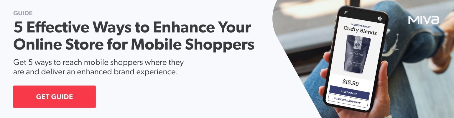
See why top ecommerce brands use Miva’s no-code platform to run
multiple stores, manage massive catalogs, and grow their revenue.
How do you avoid losing a sale just before the the end of the transaction? A seamless, easy-to-understand, and effortless-to-execute checkout experience is critical. Any kind of "checkout friction" that slows down or confuses the process can deter customers from finalizing a purchase, making the checkout page the last chance to win over that conversion. In this blog, we’ll share simple strategies to help you reduce checkout friction and bank more ecommerce success.
The single most important concept to keep in mind for reducing checkout friction is simplicity. At a glance, customers entering checkout should be able to understand the page and process clearly, with obvious cues for next steps and nothing to distract them as they move down the page.
With more than 40% of all ecommerce purchases now occurring on mobile, optimizing the checkout process for mobile users is no longer optional.
Responsive design, thumb-friendly buttons, and simplified forms are all features that cut checkout friction and lead to a smoother mobile experience. The goal is to accommodate users across various devices and screen sizes. No matter what format of mobile device a customer uses, they should be offered a checkout which performs just as well (and looks just as good) as on desktop.
Security around payments is always a concern for online shoppers. Sharing your security policy, partners, and priorities with customers at the time of checkout is an important aspect of reducing checkout friction. Addressing security concerns at the moment of payment will answer any last-minute uneasiness a customer may have about sharing their financial information.
A wealth of payment options can significantly influence a potential buyer's decision to complete a purchase. The more options are available, the broader the audience you can cater to and the more likely you are to convert. If a customer has already had positive experiences with any given payment provider, seeing their name and logo at checkout will instantly inspire confidence in the transaction.
We wrote more about how to choose payment options that lead to more conversions here.
Getting ahead of problems before they negatively impact the customer plays a crucial role in reducing checkout friction. In addition to making live chat and FAQs easily accessible, automated error detection for checkout form fills helps users prevent failed transactions in advance.
Social proof, such as reviews and testimonials, can act as a powerful motivator for completing a purchase. Positive feedback and ratings build trust and reassure customers about the quality of your products, so it makes sense to deploy them on the checkout page when the purchase decision is being finalized.
However, it is very important not to distract the customer from completing the purchase—so any page components which draw attention away from completing payment fields should be used sparingly. Reviews, users’ social media posts, and endorsements are all extremely valuable conversion drivers when used appropriately.
By streamlining the checkout process, you give customers the fastest, easiest pathway to completing a sale. At the same time, a well thought-out checkout with security guarantees, trusted payment providers, and the right amount of social proof also drives conversions, and builds trust with your customers. Make it easy for shoppers to complete the sale today, and set the stage for more successful transactions in the future.


Katy Ellquist, Miva’s Digital Marketing Strategist, is an accomplished writer, marketer, and social media analyst who has created sophisticated content campaigns for a broad range of professional clients. She brings to Miva a complex understanding of ecommerce trends and techniques, building upon extensive digital agency experience and a prior role as direct liaison to Miva’s top accounts. Katy is a regular contributor to the Miva blog, covering essential ecommerce topics like design & development strategy, site optimization, and omnichannel selling, with the goal of increasing the actionable knowledgebase of the entire Miva community.
No worries, download the PDF version now and enjoy your reading later...
Download PDF