See why top ecommerce brands use Miva’s no-code platform to run
multiple stores, manage massive catalogs, and grow their revenue.
Customers crave simplicity.
With online shopping moving quickly towards mobile, convenience is becoming a must for consumers. Overcomplicating your ecommerce checkout process can result in lost sales and unsatisfied customers. For years, ecommerce professionals have debated whether having a one-page or multi-step checkout is the best option for an online store.
In this article, we identify the differences as well as the pros and cons of having three types of checkout processes—one-click, one-page, and multi-step checkouts. We also discuss the implications of introducing open source code to customize the checkout process and whether open source checkouts are right for your business.
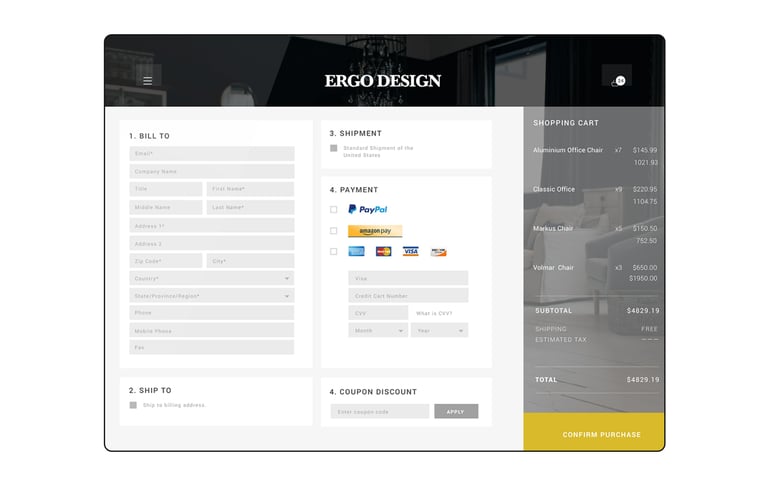
A one-page checkout displays all elements of a standard checkout including basket contents, billing and shipping address, shipping options, and payment information on one page. Originally, one-page checkouts were put into practice in an effort to simplify the check out process with fewer clicks and fewer pages.

A one-click checkout is not the same as a one-page checkout in that a one-click checkout enables customers to complete an online purchase with only a single click.
In order for one-click checkouts to work, customers must have previously entered their billing and payment information and saved it to an account. The main objective of a one-click checkout is to significantly reduce the amount of time it takes for customers to check out, and leverage convenience to increase revenue.
Amazon has played a massive role in shaping the behavior of online shoppers. Until September 11, 2017, the online retail giant owned the patent for one-click checkouts. For nearly 20 years, Amazon was legally, the only online business that could allow customers to check out with only one click. However, Apple and Barnes & Noble did offer the technology, but had to purchase the licensing rights from Amazon. Since the patent expired in September, ecommerce businesses have had the opportunity to implement this convenient technology to streamline their check out process for customers.
An excellent example of a one-click checkout is Apple Pay. Merchants that have added Apple Pay as a payment option, provide their customers the flexibility to make purchases on Mac computers, iPhones, and iPad devices, with a single touch. The payment and shipping information is pulled from a customer’s Apple account.
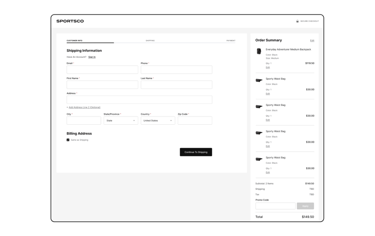
Multi-step checkouts spread out the steps of a checkout into several pages.
This type of checkout typically requires customers to manually enter their preferred shipping method, shipping and billing address, and payment information.
While multi-click checkouts take more time from the customer, some online shoppers actually prefer them because multi-click checkouts give customers another opportunity to confirm that all of the order details are correct before placing the order. In fact, Steven Soule, Miva Web Development Manager, conducted extensive research and found that customers purchasing expensive items online actually prefer a multi-page checkout versus a single page checkout. The multi-page allows customers to carefully think through their purchase and confirm all necessary information.

In theory, having an open-source checkout should mean more flexibility to customize the checkout experience. While open source checkouts may sound promising, their use on SaaS platforms is symptomatic of a lack of critical native checkout functionality. Open source checkouts on SaaS ecommerce platforms are often suggested as a way to make up for inflexible native checkouts, introducing the risks and hassle of open source solutions to users’ stores. When comparing checkout solutions, keep in mind that customizable aspects like checkout layouts (single-page vs. multi-page), form fields, and payment options should come as native features—not as an external set of tools and software to make them possible.
The most important takeaway from this is to make sure that the checkout process enables customers to check out quickly and easily whether your ecommerce store has implemented a one-click or multi-click checkout process. Remember to only collect necessary information from customers in order to keep customers focused on completing the sale. Requiring customers to fill out a survey or questionnaire can distract users, and cause them to abandon the check out if they don’t have time. Additionally, asking users for uncommon information can result in broken trust between you and your customers.
One-page, multi-step checkouts aren’t suitable for all customers. After exploring all of the options outlined above, consider administering an A/B test if you are unsure about what type of checkout to implement into your online store.
Miva’s robust MivaPay is revolutionizing the checkout process for Miva customers. With MivaPay, your customers can safely store payment information and complete transactions faster.
Considering a website redesign? Many of Miva’s ReadyTheme website templates have a built-in optimized multi-step checkout for your ecommerce store. Learn more about our ReadyThemes.
This blog was updated on December 11, 2020.

Katy Ellquist, Miva’s Digital Marketing Strategist, is an accomplished writer, marketer, and social media analyst who has created sophisticated content campaigns for a broad range of professional clients. She brings to Miva a complex understanding of ecommerce trends and techniques, building upon extensive digital agency experience and a prior role as direct liaison to Miva’s top accounts. Katy is a regular contributor to the Miva blog, covering essential ecommerce topics like design & development strategy, site optimization, and omnichannel selling, with the goal of increasing the actionable knowledgebase of the entire Miva community.
Love it? Share it!
No worries, download the PDF version now and enjoy your reading later...
Download PDF Miva
Miva
Miva offers a flexible and adaptable ecommerce platform that evolves with businesses and allows them to drive sales, maximize average order value, cut overhead costs, and increase revenue. Miva has been helping businesses realize their ecommerce potential for over 20 years and empowering retail, wholesale, and direct-to-consumer sellers across all industries to transform their business through ecommerce.
Visit Website