By Miva | January 21, 2013

See why top ecommerce brands use Miva’s no-code platform to run
multiple stores, manage massive catalogs, and grow their revenue.
According to research by eMarketer, mobile commerce—also called m commerce—sales in the US hit $24.66 billion in 2012, an increase of 81% over 2011. Total mobile sales are expected to reach $38.40 billion in 2013 and increase to $86.86 billion by 2016. Considering the amazing rate at which mobile Ecommerce is growing, there is no reason why your business shouldn’t take advantage of the mobile marketplace.

While you easily process credit card transactions and convert daily with your online site, a different set techniques is required to drive mobile commerce conversions. If you have already created a mobile site but aren’t generating as many sales or leads as expected, consider whether your site is making one of these conversion-reducing mistakes:
Heavy text and mobile don’t mix well. Mobile users expect to find the information they want quickly and easily, without having to read through a lot of extra text. Keep lengthy content off your mobile site and on your blog and about pages instead.
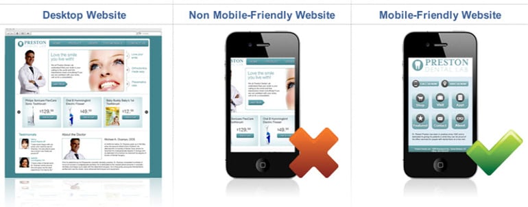
A confusing or distracting mobile website can make it difficult for potential customers to understand whether or not you accept credit cards, or where to go to even make that purchase. The screens on mobile devices are tiny compared to the average computer monitor.
HD monitors can have screen sizes upwards of 1920×1200, whereas mobile devices can be as small as 320×240. You need to simplify your mobile site and landing pages significantly if you want visitors to be able to make visual sense of your site.

SmallBizTrends.com says, “According to Google, 60% of users expect a mobile site to load in three seconds or less. More than half of users wouldn’t recommend a business with a bad mobile site.” There are several reasons why your mobile site may be losing customers due to slow load times.
While you work on simplifying your site’s design and elements, you’ll also need to concentrate on giving your call-to-action an upgrade. If your CTA is buried under lengthy text, hidden amongst numerous distracting page elements, or unclear in its wording or intent, you could be missing out on potential conversions.
Any time you make a change to your mobile site, be sure to track how the changes affect your traffic and conversions. Testing different changes and their effects is the best way to end up with a mobile site that generates significant conversions.
Megan Webb-Morgan is a web content writer for ResourceNation. She writes about small business, focusing on topics such as business mobility. Follow Resource Nation on Facebook and Twitter, too!
Back to topNo worries, download the PDF version now and enjoy your reading later...
Download PDF Miva
Miva
Miva offers a flexible and adaptable ecommerce platform that evolves with businesses and allows them to drive sales, maximize average order value, cut overhead costs, and increase revenue. Miva has been helping businesses realize their ecommerce potential for over 20 years and empowering retail, wholesale, and direct-to-consumer sellers across all industries to transform their business through ecommerce.
Visit Website