By Miva | December 10, 2012
See why top ecommerce brands use Miva’s no-code platform to run
multiple stores, manage massive catalogs, and grow their revenue.
NOTE – This is the second article in a two-part series. To read part 1 of this series, click here
Great web design is all about improving the experience for your customers. There are several things to consider regarding your ecommerce company, whether you’re just starting out or if you are evaluating the one you already have. Most of the common mistakes that are made are easily avoidable, yet not always recognized. By taking a look at these final 5 most common mistakes that ecommerce companies make, you can learn how to amend what’s already on your website or steer clear of these mistakes for the future.
The Problem: If a customer knows exactly what they are looking for, the first thing they will look for on your site is a search bar. If the search engine doesn’t find the product they were searching for, the customer will get frustrated. Having too many applicable results could be inconveniencing the customer rather than helping them find what they are looking for.
The Solution: Make sure that you have a clearly marked search engine on your website for customers to find what they already know they want to buy. Make sure that the search feature works well and has filters for letting customers refine their results. Include a way for them to filter their search results by category to eliminate the hassle of digging through search results.
Designer Tip: Make sure your e-commerce software has a good built-in search engine or use a plug-in to extend its functionality. An ideal search engine should let users search by keyword and then refine their results based on categories. Other filters that are important to include are criteria such as most popular, highest or lowest price, newest item, etc.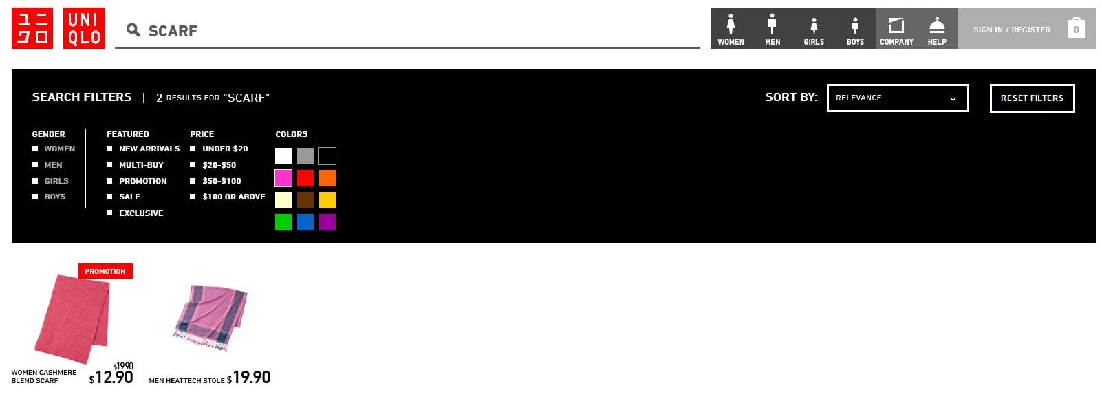
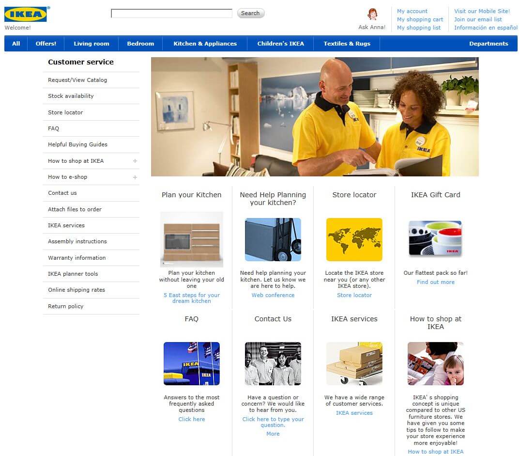
The Problem: If the customer cannot find what he/she is looking for via the site search engine above, chances are they will want to find a way to connect with customer service. Only offering an email address for help requests will make the customer feel less confident in your products and service.
The Solution: Offer a help request form to instill more confidence than just an email address. Make it clear what the best way to contact you is if they have different questions (such as: technical questions, sales, marketing, returns, etc.)
Designer Tip: Use a ticketing system for customer service inquiries, especially if you do not have a phone number available. Post an FAQ that covers the most common questions to eliminate unnecessary wait time.
The Problem: When you walk through a brick and mortar store, you will see that they group similar items together. Ice cream cones are found near the ice cream, and cell phone cases are near the cell phones. In the same way, you can group similar items together on your website and increase add-on sales for your business.
The Solution: Make sure that you use an ecommerce platform that allows you to include related products on product description pages. It will give you an even greater advantage if you choose a platform that allows you to manually choose related products. That way you can see relations that a software program doesn’t, such as coordinating clothing pieces to create an outfit.
Designer Tip: Not only can related product assignments be used to group similar items, but think about ‘accessories’ or items that pair well with the product the customer is viewing. The most common example would be an electronic device and using related products to highlight the correct batteries, tools or upgrades for that device.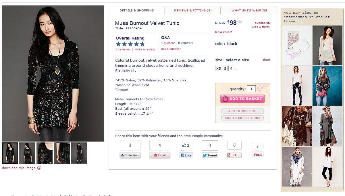
The Problem: One of the main reasons for abandoned carts is not including shipping rates. When customers are shopping online, they want to be able to complete their order all at one time. They want to know the full amount of the purchase, with shipping costs factored in right then and there. No one wants to wait around for an email to decide if the shipping charges are too high.
The Solution: Include shipping rates on your site, and make sure that they are accurate. You can use UPS or other major shipping companies to calculate shipping prices. You can also add a plug-in or widget to figure out shipping charges directly on your site. If you cannot use a plug-in or widget, you can always offer a flat shipping rate that’s high enough to cover your products. It is also very important to provide shipping policies and return policies in a FAQ section on your site.
Designer Tip: If there are particularly heavy or large items, you can include a freight surcharge on the price. Just make sure that you indicate what the additional cost is for.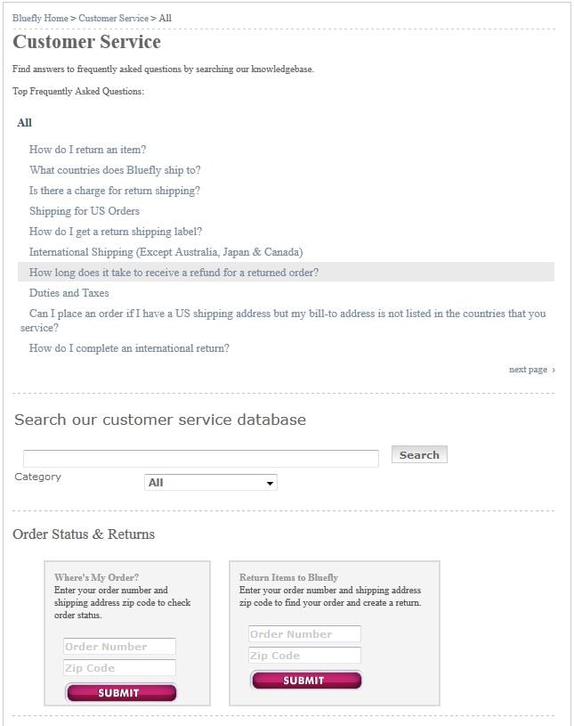
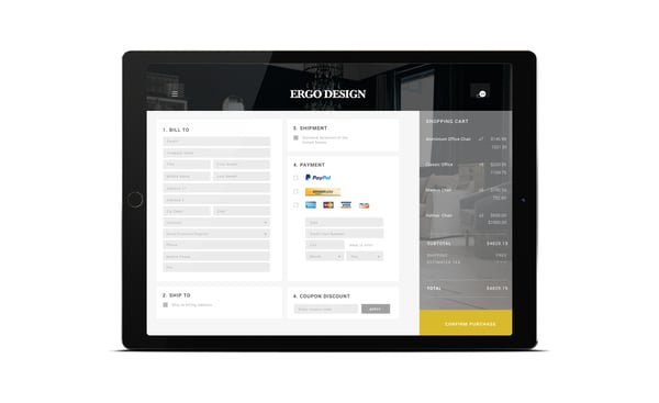
The Problem: Your shopping cart is extremely important to your ecommerce website. The design of it is imperative for creating sales. It must allow users to add multiple products, revise quantities and options about products, and it must remain transparent at the same time. Sounds difficult, right?
The Solution: Actually, it can be very easy as long as you make sure that you have chosen the right shopping cart software. Make sure that your cart lets a user add an item and then return to the last page they were on. Let your customers edit the quantities of items in their cart or remove an item from their cart, and let them preview what the shipping charges will be before they start the checkout process.
Designer Tip: Allow customers to add an item to their cart without ever leaving the page they are on by using a mini basket function.
Information and Photos derived from Smashing Magazine
Back to topNo worries, download the PDF version now and enjoy your reading later...
Download PDF Miva
Miva
Miva offers a flexible and adaptable ecommerce platform that evolves with businesses and allows them to drive sales, maximize average order value, cut overhead costs, and increase revenue. Miva has been helping businesses realize their ecommerce potential for over 20 years and empowering retail, wholesale, and direct-to-consumer sellers across all industries to transform their business through ecommerce.
Visit Website