By Miva | November 29, 2012

See why top ecommerce brands use Miva’s no-code platform to run
multiple stores, manage massive catalogs, and grow their revenue.
Great web design is all about improving the experience for your customers. There are several things to consider when you start your ecommerce company, even if you are just evaluating the one you already have. Most of the common mistakes that are made are easily avoidable, yet not always recognized. By taking a look at these 10 most common mistakes that e-commerce companies make, you can learn how to amend what’s already on your website or steer clear of these mistakes for the future.
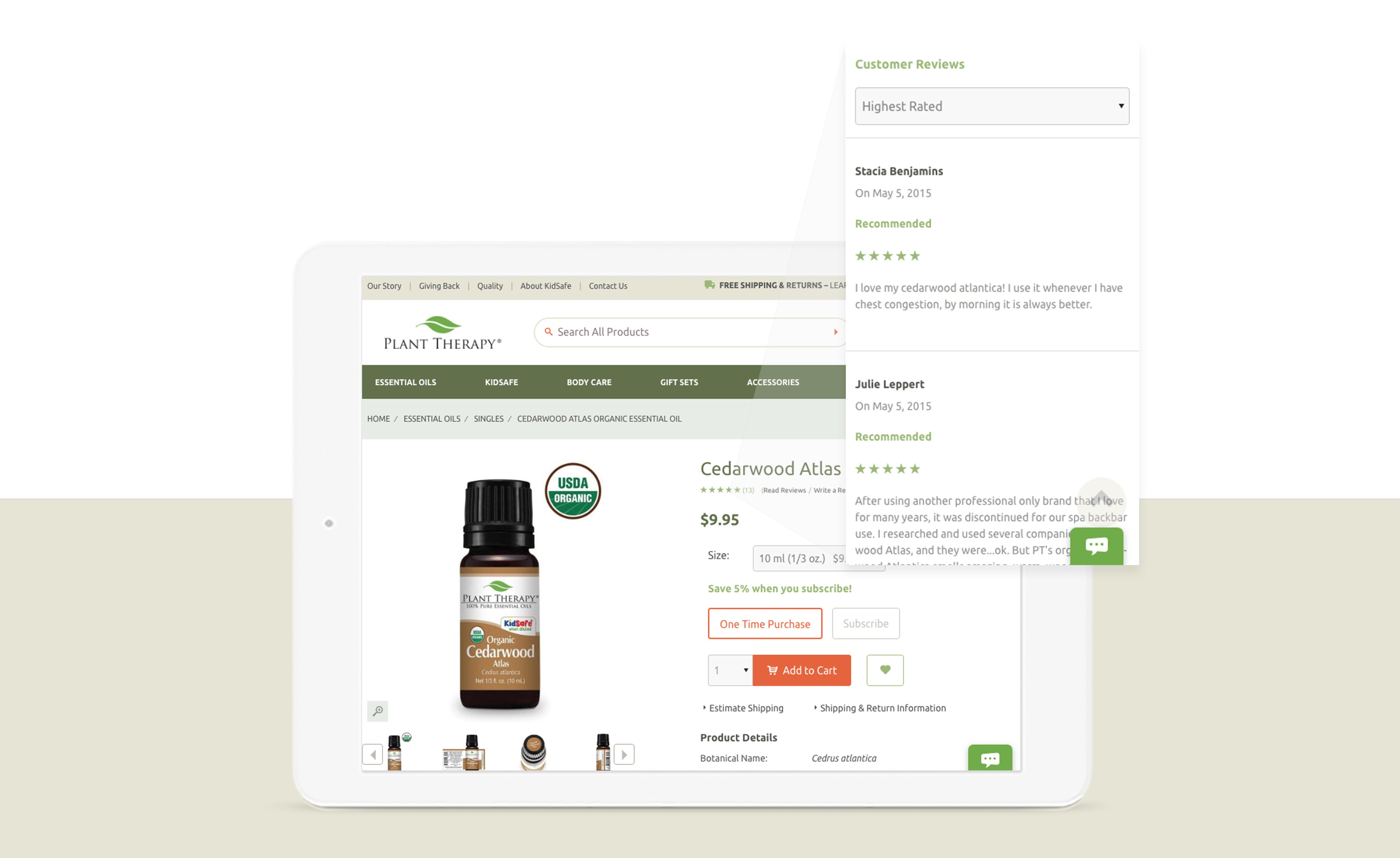
The Problem: When you own an ecommerce business, as opposed to a brick and mortar store, your customers cannot physically touch the item, feel its weight, and look at it from every angle. They also don’t have an employee asking them if they have any questions. So, excellent product information is essential to building your business.
The Solution: Rather than just listing the name of the item with one or two points, anticipate the type of questions that your customer would ask. If you get frequent questions about a product, make sure to include the answers for all customers to see. For example, if you are a clothing ecommerce store, you could include the fabric type, sizes, colors available, size charts. Get even more detailed with the weight, thickness, the cut and fit of the item, care instructions, or comments about the brand or designer.
Designer Tip: Use descriptive words rather than simply technical terms to influence the consumer’s decision.

The Problem: If the customer wants to contact you and your contact information is hidden or not easy to find, there is a good chance that they will not trust your company and move on with their sale elsewhere. They want to know that they can talk to a real person and get help if needed.
The Solution: Place your contact information in an easy-to-find place on every page of your website. Most customers will first look to your header to find your contact info. Other good places to have it would be at the top of the side bar and/or in the footer of the website. Instead of just offering an email address, add a help request form or a ticketing system for customer service inquiries. This will help instill more confidence in your company and your product.
Designer Tip: The more expensive or technical the product, the more likely a customer is going to want to contact you.
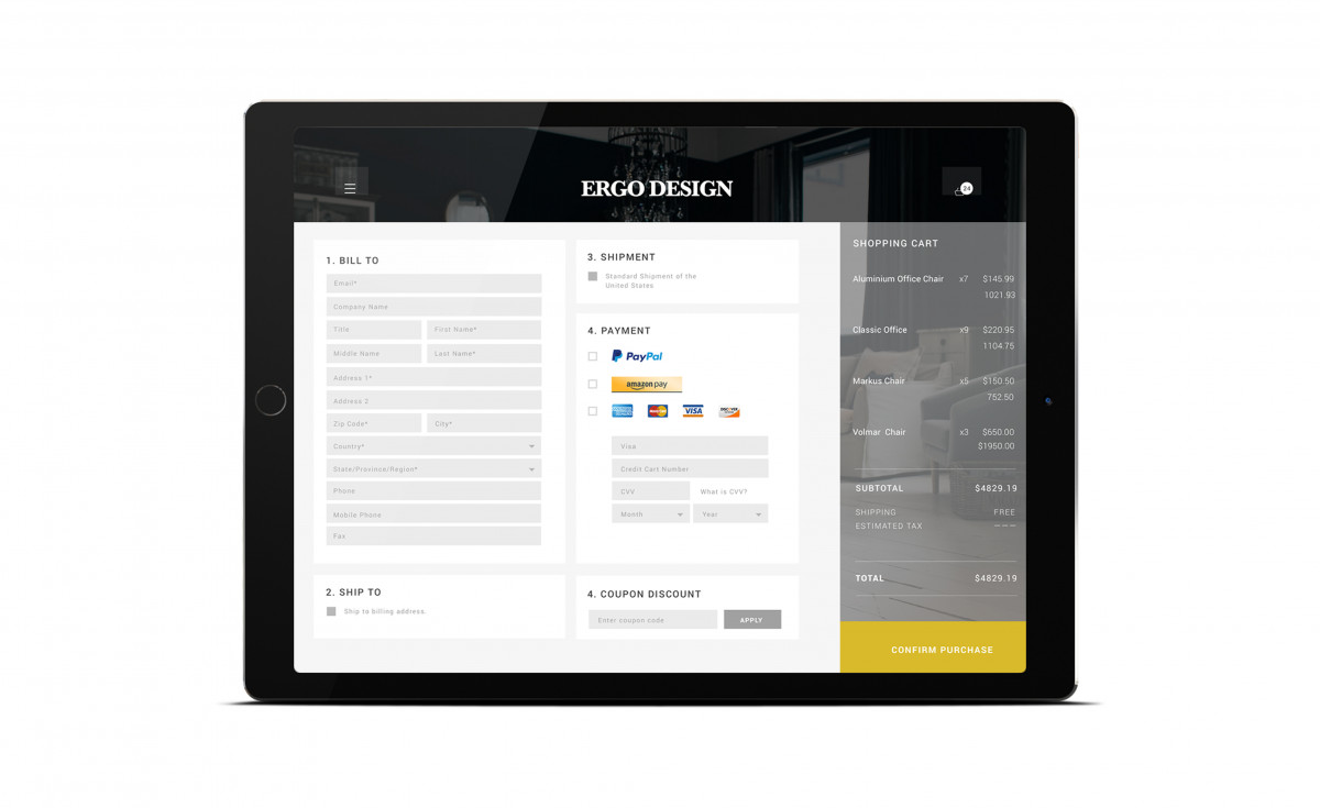
The Problem: The more steps it takes for the customer to purchase the item, the more unlikely it is that the customer will finish the sale. 59% of all users abandon the checkout process, so it is important to keep frustration, confusion, and abandonment to a minimum.
The Solution: Providing a progress indicator gives your customers a sense of control, which is very important from a usability perspective. This will also eliminate confusion if they understand what stages are still to come and when they are finished. Keeping the checkout interface as simplified as possible will keep your customer focused on the task at hand (purchasing the item). Give them an option to save their account information to make placing future orders easier, and give them a way to track their current order. The key here to an easy checkout process is to minimize and clarify the process.
Designer Tip: Remember your customers are there to shop, not to fill out forms. Make sure that registration is done during the checkout process and not before- and absolutely not before the visitor places items in their shopping basket
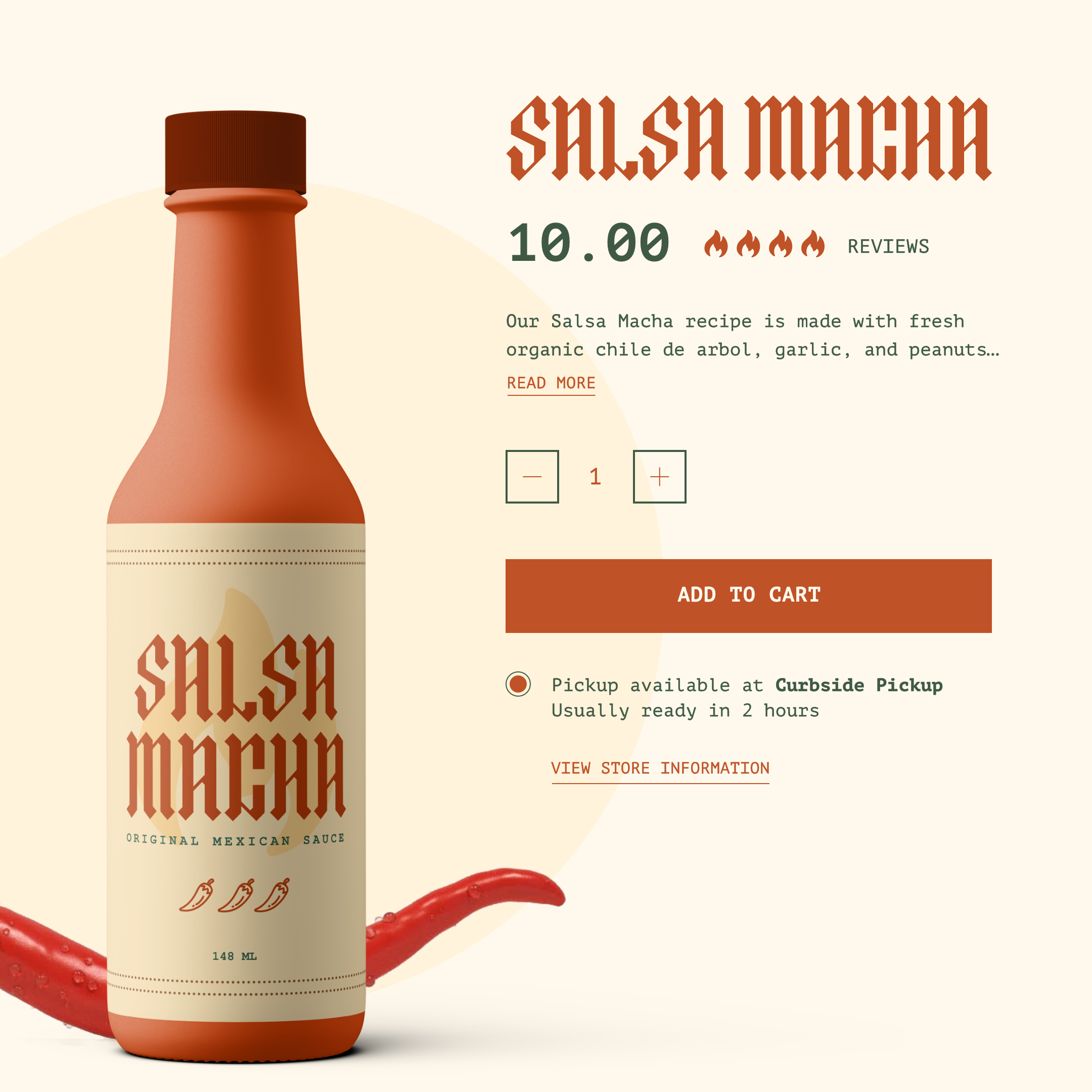
The Problem: Tiny product images. No matter how awesome your products actually are, if the pictures don’t do it justice, your customers aren’t going to buy it.
The Solution: Your images need to give them an experience as close to “real life” as possible. Use large images with the ability to zoom in even further. You will want the image to be as large as is practical for average monitor sizes. So, an image that enlarges to 1024X768 pixels is a good size to aim for. If you can incorporate your product working in a short video, it will help your customer to feel more comfortable making the purchase final.
Designer Tip: Keep the backgrounds simple, don’t underestimate the importance of lighting, and give your products the attention to detail that they deserve. 
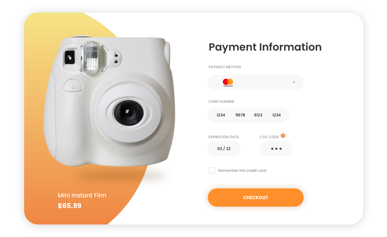
The Problem: A lack of payment options = a lack of sales. If you are not targeting online shoppers by letting them pay with the method of their choice, you will lose sales. If you are only allowing users to pay with Visa or MasterCard, then could potentially turn away the customer who doesn’t have a credit card and wants to pay directly from their bank account. Perhaps, someone might prefer to charge online purchases to their PayPal Account for security purposes.
The Solution: Provide as many payment options as you can to optimize the experience. This will help you capture more sales. Use PayPal to accept credit cards, debit cards, and PayPal payments on your website. Payment Processing options, such as Google Checkout and CHASE Paymentech, will help you provide great service to your customers that they will thank you for with their sales.
Designer Tip: Make sure that all payment options are accessible from both PCs and mobile devices. 
Information and photos derived from Smashing Magazine
Back to topNo worries, download the PDF version now and enjoy your reading later...
Download PDF Miva
Miva
Miva offers a flexible and adaptable ecommerce platform that evolves with businesses and allows them to drive sales, maximize average order value, cut overhead costs, and increase revenue. Miva has been helping businesses realize their ecommerce potential for over 20 years and empowering retail, wholesale, and direct-to-consumer sellers across all industries to transform their business through ecommerce.
Visit Website