By Vanessa Loughty | December 7, 2023

See why top ecommerce brands use Miva’s no-code platform to run
multiple stores, manage massive catalogs, and grow their revenue.
Product discovery is the process through which customers find your products. Buyers arrive at products through any number of means, many of which originate long before they arrive at your website. Once they do however, some simple adjustments to site organization can help you lead them to products which connect with their needs and result in a conversion.
Streamlining this process on your site can significantly enhance the customer experience and boost sales—a great way to start is by leveraging categories and subcategories to optimize discovery and guide customers smoothly through your inventory. This blog explains best practices around categorization.
The concept of “intuitive categorization” is the foundation of effective product discovery. This means that by grouping similar items together, you enable users to navigate your site with ease and find what they're looking for more quickly. That sounds obvious, but with so many different ways to organize the same products, category headings that are unclear, too similar, or divide products in a way that is not natural for buyers are all common pitfalls.
For example, a clothing retailer might choose to categorize items by gender, type, price, season, etc. While a mega-menu can encapsulate all of these different filters in a single drop-down, your primary categories will set the tone for how a customer interacts with your site, and identify to them what is important about items. So, excellent master categories are a partnership between what you think is important about products and what customers are looking for when they arrive.
When selecting sub-categories, the user’s search can be refined even more, as you direct them down through a cascade of increasingly specialized identifiers. Again, with so many attributes and use cases to choose from, the way in which you use sub-categories should reflect the varying importance of these qualities for you and your customers.
A category and sub-category flow which leads from Auto Parts > Trucks > Ford F-150 > Spark Plugs is oriented to a customer who is shopping for parts for their make and model. Conversely, the same store might organize its categories from Auto Parts > Value Bundles > Spark Plugs > Ford Trucks for customers who are more motivated by deals and price. Think about what drives a customer as they sift through products, and order your sub-categories accordingly.

Beyond categories and subcategories, providing advanced search filters, facets, and sorting options is a powerful way to put product discovery into your customers’ hands.
Users should be able to filter products based on various attributes like size, color, price range, and customer ratings, or look for individual keywords. Search “facets” are filters which can be selected to narrow search results, after sellers have tagged items with those terms. You can offer users a range of common facets to sift by, or simply let them search for any term they desire. We wrote more about how to use faceted search here.
Implementing sorting options such as “Best Selling”, “Highest Rated”, or “New Arrivals” further empowers customers, allowing them to tailor their own browsing experience. All of these search refinements are excellent forms of site personalization—merchants should always look for ways to help customers shape their shopping experience to be as relevant as possible. A modern search experience can the place of a salesperson or customer service rep, lowering resource drain while supporting shoppers.
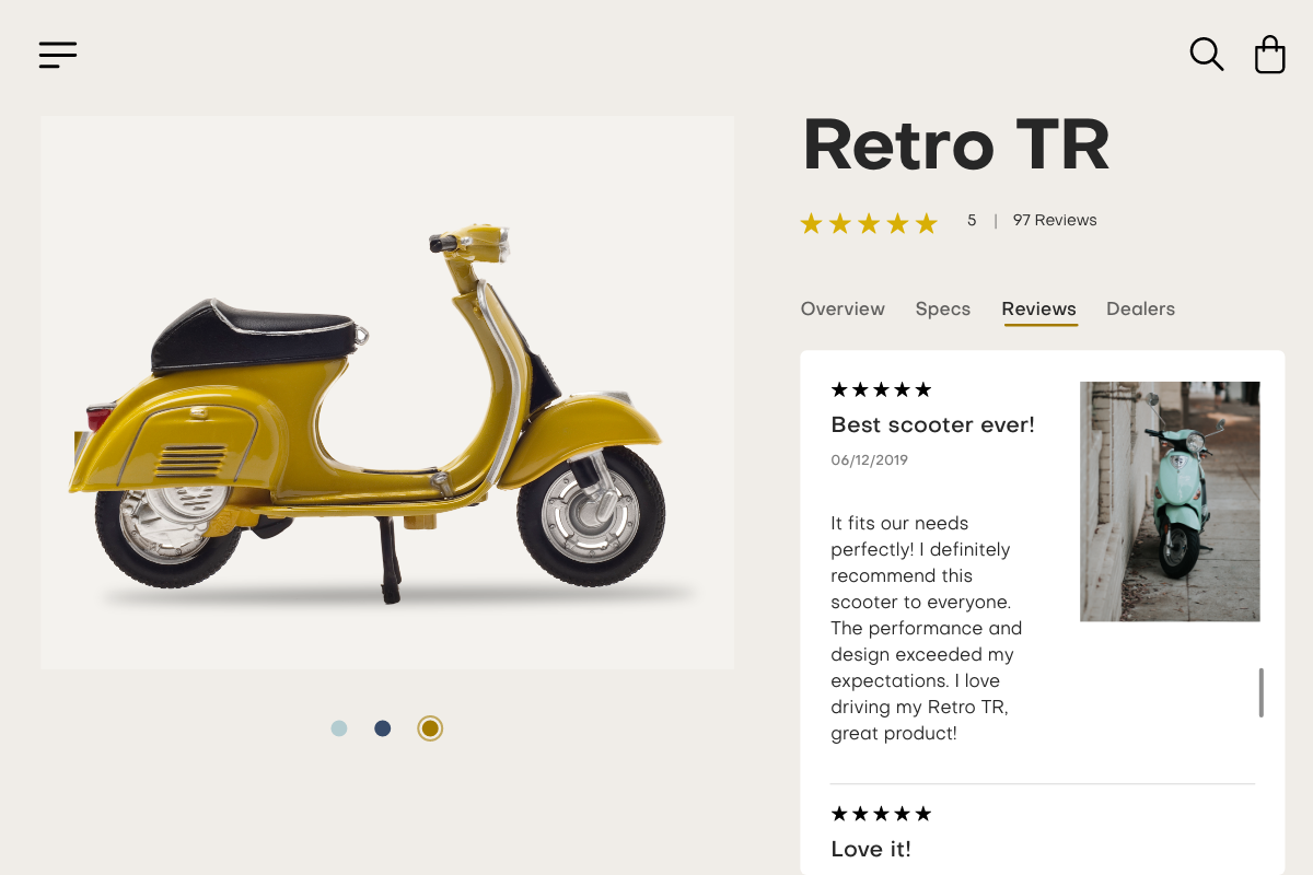
Visual elements play a crucial role in guiding users through your site and are the consistently the most effective type of content connected to products. Ecommerce product discovery hinges on eye-catching images which can draw a user’s attention to a specific part of a page, or in the case of ads, perhaps convince them to click-through to another website altogether.
The image has to do more than just direct attention. In one glance, shoppers need to get a clear sense of what the product’s function is, its size and shape, and its aesthetic look. Furthermore, product images can connote all sorts of details about your value prop, possible use cases, brand lifestyle, and product quality. Each image can become a gateway for customers to new products, and new reasons to buy them, so the importance of crafting great product images cannot be understated.
High-resolution professional images (compressed to load quickly), distinct icons, and clear typography all contribute to a user-friendly interface. Choices about background color and other presentation elements are just as important as the product itself. Each and every image needs to represent the style, offerings, and value of the total brand.
By implementing intuitive categories and subcategories, offering detailed search filters, and prioritizing visual content, you can connect buyers with product more quickly, while significantly enhancing their user experience. The key is to think about why a user has come to your site, and then organizing category structures to facilitate that exact purpose. These strategies can create the feeling of a seamless product discovery journey, ultimately driving more sales.

Katy Ellquist, Miva’s Digital Marketing Strategist, is an accomplished writer, marketer, and social media analyst who has created sophisticated content campaigns for a broad range of professional clients. She brings to Miva a complex understanding of ecommerce trends and techniques, building upon extensive digital agency experience and a prior role as direct liaison to Miva’s top accounts. Katy is a regular contributor to the Miva blog, covering essential ecommerce topics like design & development strategy, site optimization, and omnichannel selling, with the goal of increasing the actionable knowledgebase of the entire Miva community.
Love it? Share it!
No worries, download the PDF version now and enjoy your reading later...
Download PDF Vanessa Loughty